
A desire for something real
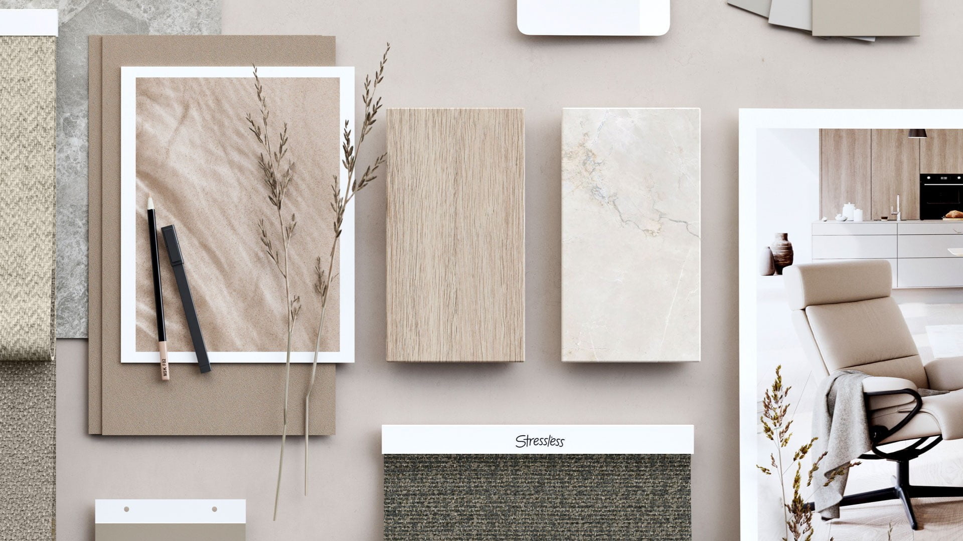
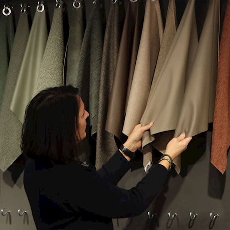
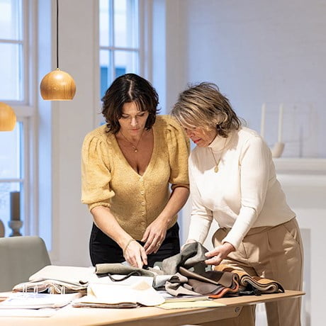
One of the most important consumer trends we see this year, is the need for nurture, care and reconnection. In a world filled with rapid change, our homes and interiors are safe spaces, and at the same time ways of expressing ourselves. The materials and colours we surround ourselves with, become an important part of the narrative of who we really are. That is why we see a higher demand for materials and colours that symbolise something real, lasting and trustworthy.
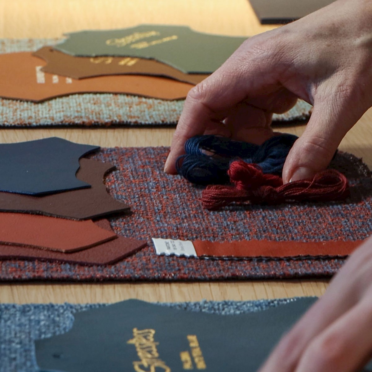
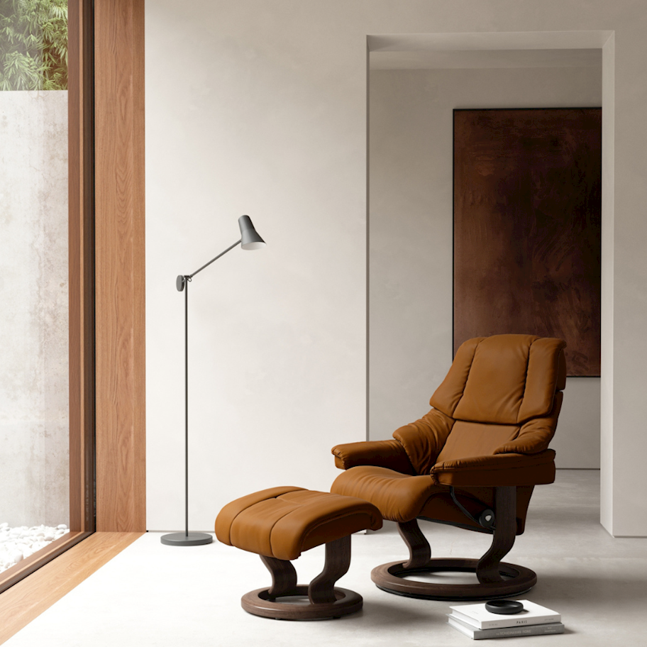
- First of all, I’m glad to see that many of our existing covers fit right into the emerging trends, both in colour, structure and quality. This proves their longevity, a goal we always strive for. But we also have lots of news in store! Let’s start with browns, for instance. Mustard, terracotta and rust tones are added to the Stressless® color roster, which already contains several browns. These are safe choices in a timeless interior, Muri says.
Muri also mentions warm, calming neutrals inspired by wood, sand and other natural materials as a global developing trend.
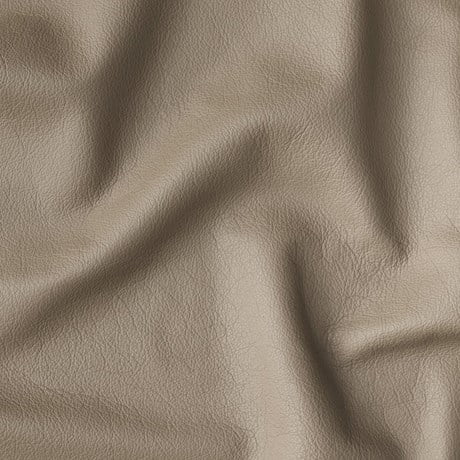
- Scandinavian design has utilized these tones for decades, proving their longevity. Even indoor wood panelling is back in style, complementing these tones perfectly. Batick Milky White is an almost white leather, with a tiny hint of red.
These might also interest you

Our passion for pure quality

Curate Your Golden Hour with Letters of Intent

The art of winter

Designing for the body

The Pleasures and Benefits of resting to recharge your mind

SewYeah

Where Comfort Meets Captivating Beauty

Unity through diversity and inclusion

How we make furniture that lasts
We believe that tangible change comes from the daily practises we commit to consistently.

The great Norwegian furniture rush

A desire for something real

Feel free to feel blue

Set the table for an unforgettable evening
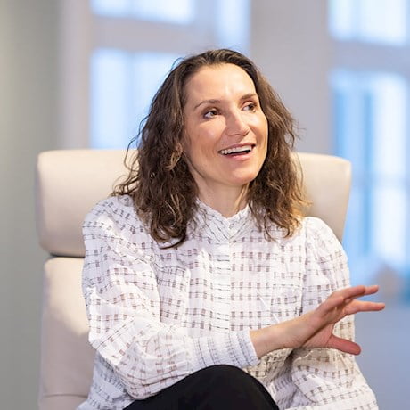
Meet Birgitta Roald.

A timeless classic in a new outfit
Boost your mood with warm colors

Taking motorized sofas to new heights
The new and innovative Stressless® Anna sofa is lighter and more powerful – and the result of jumping at the opportunity.

Classic comfort meets modern design
Named after the city that epitomizes the blend of tradition and innovation, the brand new Stressless® Berlin recliner has already made heads turn.
Retailers in Central Europe rush to place their orders.

Where work meets nature
Imagine going straight to the mountains after work, sleeping under the open sky and skiing back down at sunrise. That is the reality of some of our nature-loving employees.
Meet two enthustiastic employees.

Supporting the joy of gardening
Colours to embrace and uplift 2023
Here are the key colours for 2023.
Looking into the crystal ball of colours
Curves are in our nature
Why is this? Is it a learnt preference, or is it evolution?
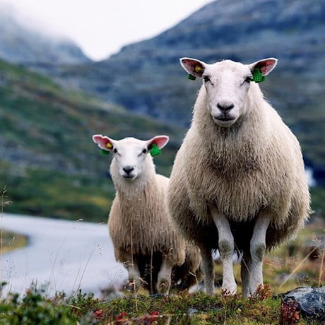
The future looks wooly
The importance of me-time
Taking breaks during the day is essential for maintaining your physical and mental health.
We asked a psychiatrist for her best advice on winding down.
Like a warm embrace
The Stressless® Reno has been among the company’s top sellers for close to three decades.
What’s the secret behind its success?