01 Design
A desire for something real
Published: 07.02.2024
Images: Ekornes AS, Emma Langlo
People: Trend expert Janne Muri
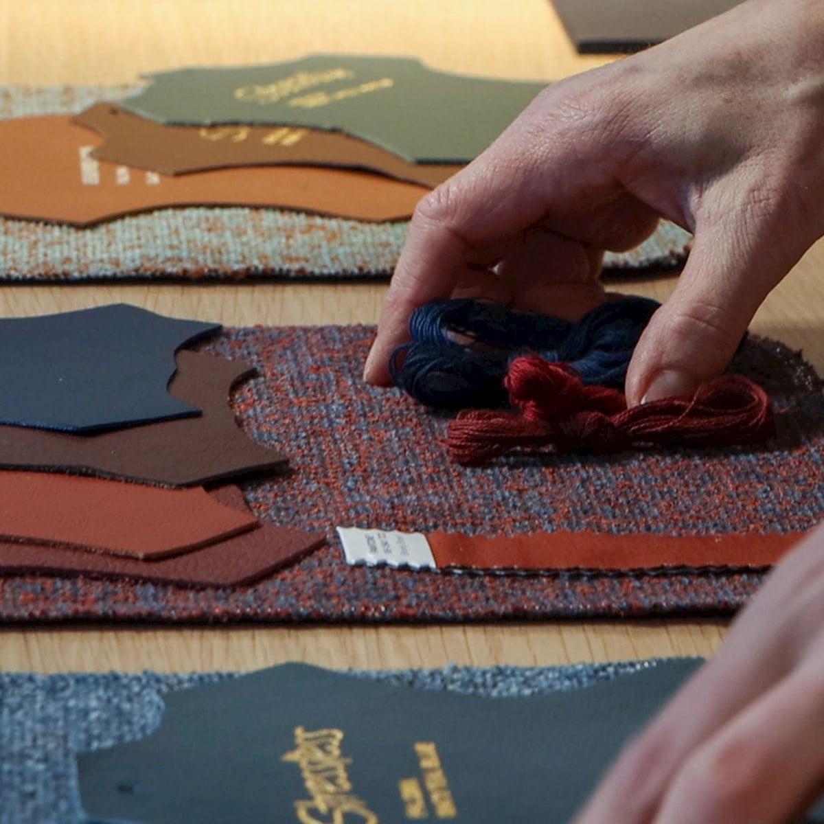
The new Stressless® colour palette reflects our need for reconnecting with the natural world.
One of the most important consumer trends we see this year, is the need for nurture, care and reconnection. In a world filled with rapid change, our homes and interiors are safe spaces, and at the same time ways of expressing ourselves. The materials and colours we surround ourselves with, become an important part of the narrative of who we really are. That is why we see a higher demand for materials and colors that symbolize something real, lasting and trustworthy.
One of the most important consumer trends we see this year, is the need for nurture, care and reconnection. In a world filled with rapid change, our homes and interiors are safe spaces, and at the same time ways of expressing ourselves. The materials and colours we surround ourselves with, become an important part of the narrative of who we really are. That is why we see a higher demand for materials and colors that symbolize something real, lasting and trustworthy.
Trend expert Janne Muri is Head of CMF (Colours, Materials and Finishes) team at Ekornes. When she set out to refresh the Stressless® colour palette for 2024, she found inspiration in this global desire for deeper values.
- What are some of the colour choices we can expect to see on Stressless® recliners, chairs and sofas this year?
- First of all, I’m glad to see that many of our existing covers fit right into the emerging trends, both in colour, structure and quality. This proves their longevity, a goal we always strive for. But we also have lots of news in store! Let’s start with browns, for instance. Mustard, terracotta and rust tones are added to the Stressless® color roster, which already contains several browns. These are safe choices in a timeless interior, Muri says.
- First of all, I’m glad to see that many of our existing covers fit right into the emerging trends, both in colour, structure and quality. This proves their longevity, a goal we always strive for. But we also have lots of news in store! Let’s start with browns, for instance. Mustard, terracotta and rust tones are added to the Stressless® color roster, which already contains several browns. These are safe choices in a timeless interior, Muri says.
Nature and nurture
Muri also mentions warm, calming neutrals inspired by wood, sand and other natural materials as a global developing trend.
- Scandinavian design has utilized these tones for decades, proving their longevity. Even indoor wood panelling is back in style, complementing these tones perfectly. Batick Milky White is an almost white leather, with a tiny hint of red. The Bloom textile comes in the very versatile Offwhite and Grey, and matches many of our excisting leather and textile colours.
The refreshed palette also contains several blues, reminiscent of sea and sky, alongside forest and grass greens, rocky and sandy grays, and natural golden tones.
The new rustic fabric Bloom is available in the moss-like Green and the exciting green and brown Jade Caramel, especially created for the Nordic markets.
- In a word, there is something here for everyone, Muri says.
- In a word, there is something here for everyone, Muri says.
Magazine arcticles


