
01 Design
A desire for something real
Published: 07.02.2024
Images: Ekornes AS, Emma Langlo
People: Trend expert Janne Muri
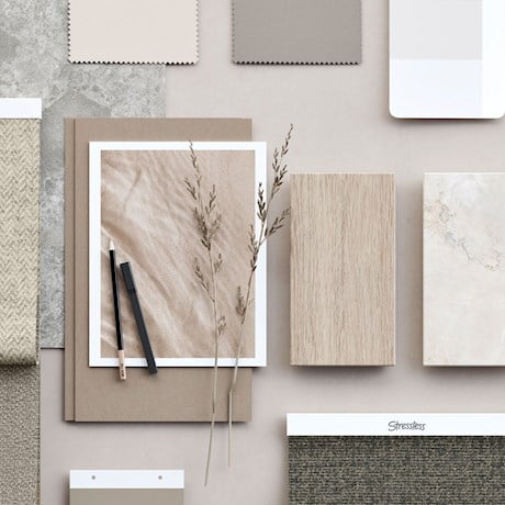
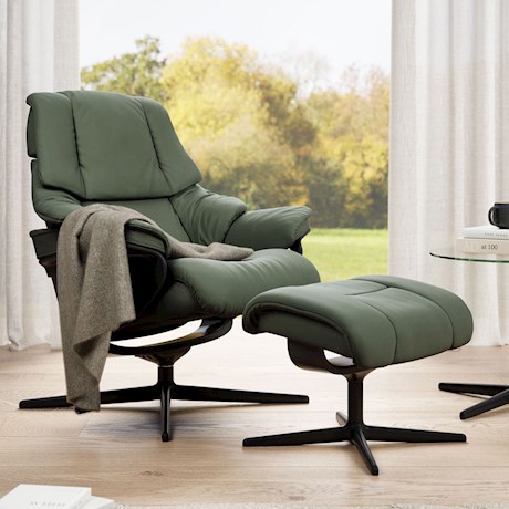
The new Stressless® colour palette reflects our need for reconnecting with the natural world.
One of the most important consumer trends we see this year, is the need for nurture, care and reconnection. In a world filled with rapid change, our homes and interiors are safe spaces, and at the same time ways of expressing ourselves. The materials and colours we surround ourselves with, become an important part of the narrative of who we really are. That is why we see a higher demand for materials and colors that symbolize something real, lasting and trustworthy.
One of the most important consumer trends we see this year, is the need for nurture, care and reconnection. In a world filled with rapid change, our homes and interiors are safe spaces, and at the same time ways of expressing ourselves. The materials and colours we surround ourselves with, become an important part of the narrative of who we really are. That is why we see a higher demand for materials and colors that symbolize something real, lasting and trustworthy.
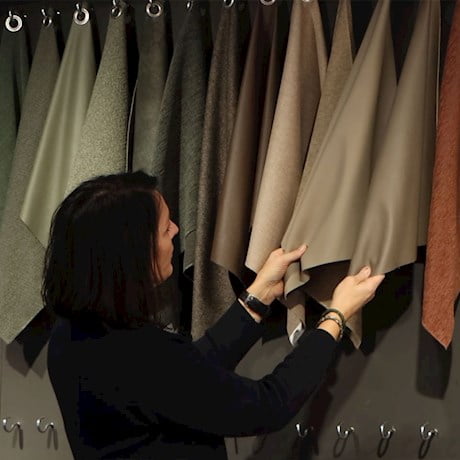
Trend expert Janne Muri is Head of CMF (Colours, Materials and Finishes) team at Ekornes. When she set out to refresh the Stressless® colour palette for 2024, she found inspiration in this global desire for deeper values.
- What are some of the colour choices we can expect to see on Stressless® recliners, chairs and sofas this year?
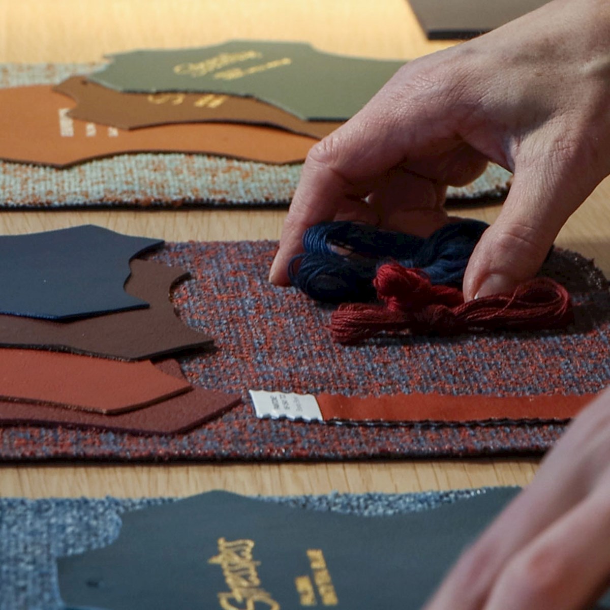
- First of all, I’m glad to see that many of our existing covers fit right into the emerging trends, both in colour, structure and quality. This proves their longevity, a goal we always strive for. But we also have lots of news in store! Let’s start with browns, for instance. Mustard, terracotta and rust tones are added to the Stressless® color roster, which already contains several browns. These are safe choices in a timeless interior, Muri says.
- First of all, I’m glad to see that many of our existing covers fit right into the emerging trends, both in colour, structure and quality. This proves their longevity, a goal we always strive for. But we also have lots of news in store! Let’s start with browns, for instance. Mustard, terracotta and rust tones are added to the Stressless® color roster, which already contains several browns. These are safe choices in a timeless interior, Muri says.


Nature and nurture
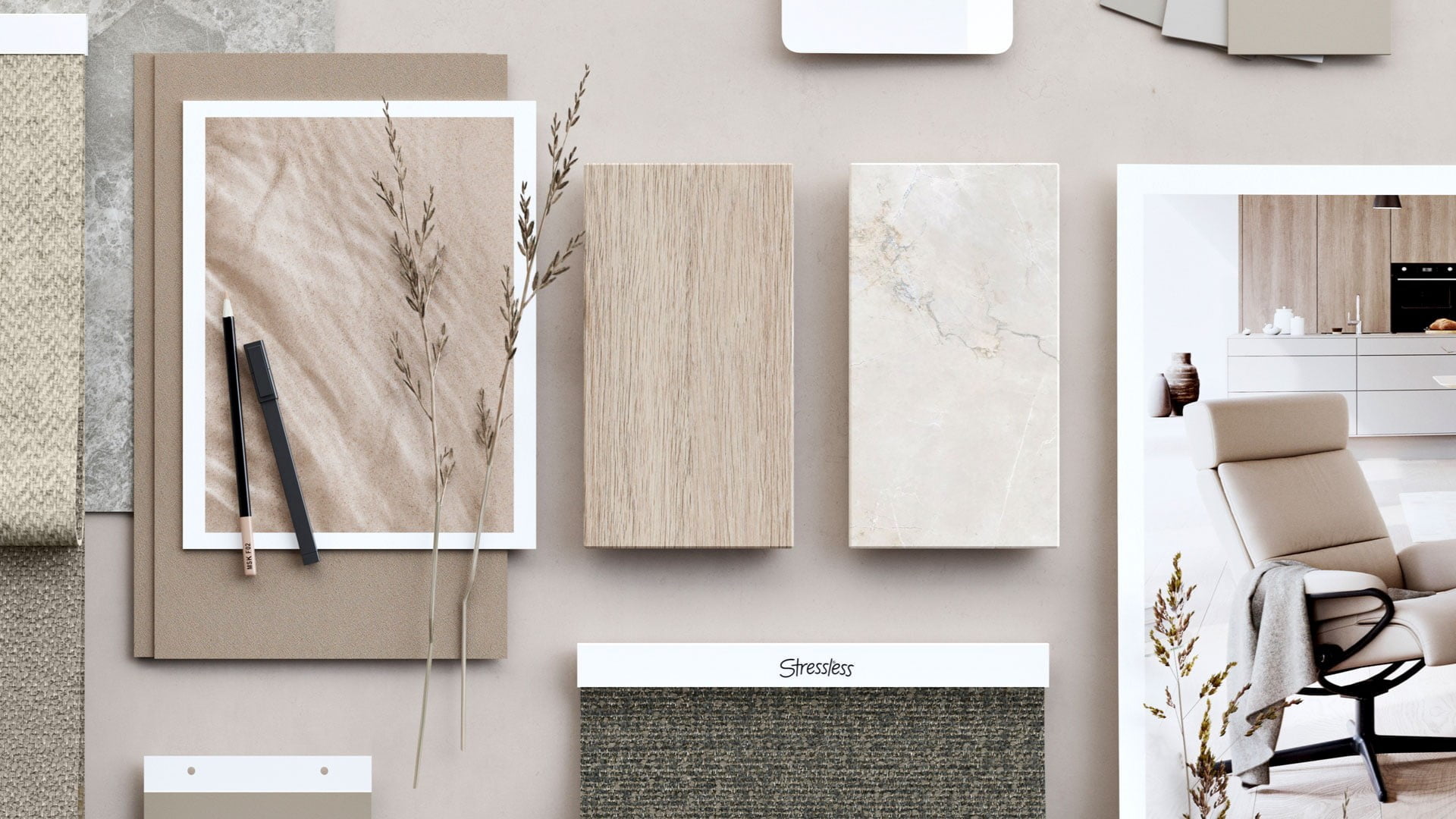
Muri also mentions warm, calming neutrals inspired by wood, sand and other natural materials as a global developing trend.
- Scandinavian design has utilized these tones for decades, proving their longevity. Even indoor wood panelling is back in style, complementing these tones perfectly. Batick Milky White is an almost white leather, with a tiny hint of red. The Bloom textile comes in the very versatile Offwhite and Grey, and matches many of our excisting leather and textile colours.
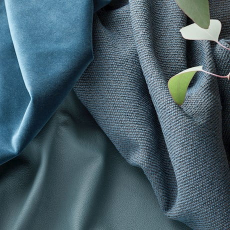
The refreshed palette also contains several blues, reminiscent of sea and sky, alongside forest and grass greens, rocky and sandy grays, and natural golden tones.
Muri also mentions warm, calming neutrals inspired by wood, sand and other natural materials as a global developing trend.
- Scandinavian design has utilized these tones for decades, proving their longevity. Even indoor wood panelling is back in style, complementing these tones perfectly. Batick Milky White is an almost white leather, with a tiny hint of red. The Bloom textile comes in the very versatile Offwhite and Grey, and matches many of our excisting leather and textile colours.
The refreshed palette also contains several blues, reminiscent of sea and sky, alongside forest and grass greens, rocky and sandy grays, and natural golden tones.


The new rustic fabric Bloom is available in the moss-like Green and the exciting green and brown Jade Caramel, especially created for the Nordic markets.
- In a word, there is something here for everyone, Muri says.
- In a word, there is something here for everyone, Muri says.
Magazine arcticles
These might also interest you

Our Passion for Pure Quality
At Stressless® we pride ourselves on craftsmanship and quality materials. With a commitment to first rate design that has been honed over five decades and passed through generations.
Read the article

The art of winter
The turn of the calendar often arrives with the promise of a pause. An opportunity to rest, reflect and a chance to begin anew.
Read the article

Designing for the body
What makes a comfortable seat? We certainly know. Ekornes literally shaped the furniture world when the company developed the first Stressless® recliner, an iconic design that still retains every bit of its original desirability today.
Read the article

The Pleasures and Benefits of resting to recharge your mind
In today’s fast-paced society, where many of us are constantly on the go, and feel the cumulative toll of constant alerts vying for attention, psychologist Tomas Myklebust offers a refreshing reminder: rest is not an indulgence—it’s a necessity.
Read the article
SewYeah
If there ever was an ideal time to slow down and catch one’s breath, it’s now. As the days draw in and outside temperatures drop, it’s time to align ourselves with the seasons and live as nature intended, relishing time spent indoors.
Read the article
Where Comfort Meets Captivating Beauty
Travelling through the Norwegian fjords is an adventure filled with breathtaking sights – from dramatic cliffs and serene waters to quaint coastal villages.
Read the article

Unity through diversity and inclusion
To learn more about the diverse and inclusive work culture we cultivate, we share some heartwarming stories and impactful initiatives that make Stressless a beacon of unity.
Read the article
The great Norwegian furniture rush
A Norwegian saying claims that you can create gold from stone. One proof of this is the booming furniture village of Sykkylven.
Read the article
A desire for something real
The new Stressless® colour palette reflects our need for reconnecting with the natural world.
Read the article
Feel free to feel blue
Bring the magical hour inside, and immerse yourself in its soothing colours for as long as you desire.
Read the article
Set the table for an unforgettable evening
The stylist's best tips for decorating your party table are surprisingly simple.
Learn more
A timeless classic in a new outfit
Stressless® Reno never goes out of style, and truly shines in this new attire.
Find out more
Boost your mood with warm colors
Feeling a bit chilly, both inside and out? Warm up with earthy colors!
Meet Janne Muri, Project Manager CMF